OPENING HOURS MON - FRI: 09:00 - 17:00

Refined interiors and a semi-private dining area pack a punch at renovated Zest restaurant
Refined interiors and a semi-private dining area pack a punch at renovated Zest restaurant
| By Martina Bartolo Parnis | May 29, 2024
In approximately nine days and behind closed doors, a flurry of activity transformed the renowned Asian fusion Zest Restaurant into a refreshed, elegant and calmer version of its former self.
Led by interior designer and founder of Greta Design, Greta Apap Bologna, her team and a long list of contractors injected the popular St Julian’s eatery with an elegant aesthetic that is at once sophisticated yet calm.

“Time was of the essence. The owners couldn’t afford the time to close the restaurant for long,” Greta tells DesignDispatch, explaining that she was approached by the client, Hotel Juliani, to bring a fresh and more current ambiance to Zest, which opened its doors around 20 years ago and underwent a minor refurbishment back in 2019.
“The client wanted to keep certain elements of the original design, therefore we thoroughly analysed what needed to be updated and what could remain. This exercise was extremely laborious as we had to ensure the changes we were recommending could take place in a timely manner and of course on budget.”

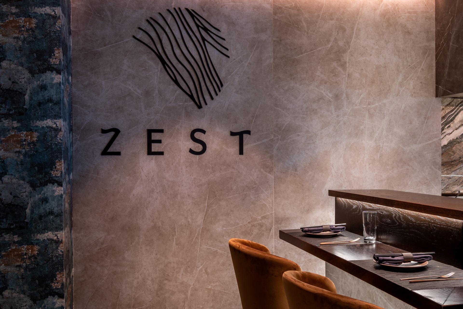
The new design left the restaurant layout mainly intact, and focused primarily on turning the reception into a lounge area, updating the existing sushi counter and setting up a semi-private dining area with an overall upgraded interior scheme.
“For the lounge area, I wanted to create a sitting room feel, where one can enjoy a few drinks before dinner. We opted for a variety of seating options, coffee tables and rugs to achieve this relaxed vibe. For the sushi bar, we changed the height of the previous counter and made some further alterations to make the area more attractive and guest-friendly, facilitating interaction with the sushi chef behind the counter.


The team also created a semi-private dining area that can seat up to 12 persons, which “totally changed the dynamics of this space and is now in high demand by guests choosing to stay there.” The banquet marble table is complemented by dark wood armchairs and cushions that create an ideal setting for an intimate yet indulgent dinner.
As the flooring and dark wooden tables remained from the original design, Greta asserts that the team already had a colour palette to build upon.

“The previous design had bold accent colours – mustard and peacock blue/green. Back when the restaurant first opened, it had accent colours of pink and orange. This time around, I felt it needed a change from these bold colours with a softer approach that also complements the colour scheme and concept of the rest of Hotel Juliani.”
The team settled on a muted palette of shades of verdigris, soft blues, mink and a warm grey. A plaster-effect wallpaper added a textured effect to some of the walls, while upholstery was used generously throughout this project; for the wall panels which aided the acoustics of the restaurant, made from recycled PET bottles; for all the existing banquette seating and the new, custom scatter cushions in the seating areas that add warmth and visual interest.


“We also introduced elements of corten steel which worked really well with the rest of the finishes. Inside, we introduced wall panels (that are also acoustic) of natural, cream-coloured moss as opposed to the usual green, framed in corten steel that fitted in well with the overall décor,” says Greta.
For the outdoor dining terrace, new furniture, wall paint, lighting and planters were chosen, and “a bespoke artwork was designed by my studio for the outside wall, manufactured and laser cut out of corten steel, which depicts a play of leaves overlapping each other.”

Plenty of emphasis was placed on lighting, where Greta says “the client invested in an excellent lighting system which allows all individual light fittings to be dimmed separately. This is extremely important in setting the right atmosphere.”
The sushi bar, for instance, was previously dark, “and part of our brief was to ensure that the sushi chef and diners both have the right amount of light to enjoy working and eating. We also clad the area with a beautiful backdrop for the diners sitting there, while strategically lighting up the counter top so that there is never a bright light in anyone’s face.”

Having planned and choreographed the works from months ahead, Greta’s team, particularly Davide Patane’, contractors and suppliers were able to pull off the refurbishment without a hitch. “We couldn’t afford to go beyond the time allocated for the works. It was all clockwork from the word go!”

“My client, represented by Erika Cassar Rouvelas, my colleague Davide and myself worked extremely well together and left no stones unturned. It was a combination of a lot of love and dedication, all pooled into one amazing project. The result is exactly what we had hoped for.”
Photography: Eugenia & Sandor
Source: designdispatch.mt
- Category : Publication
- Type :
Created
10 months Ago

